
SaaS Analytics Dashboard
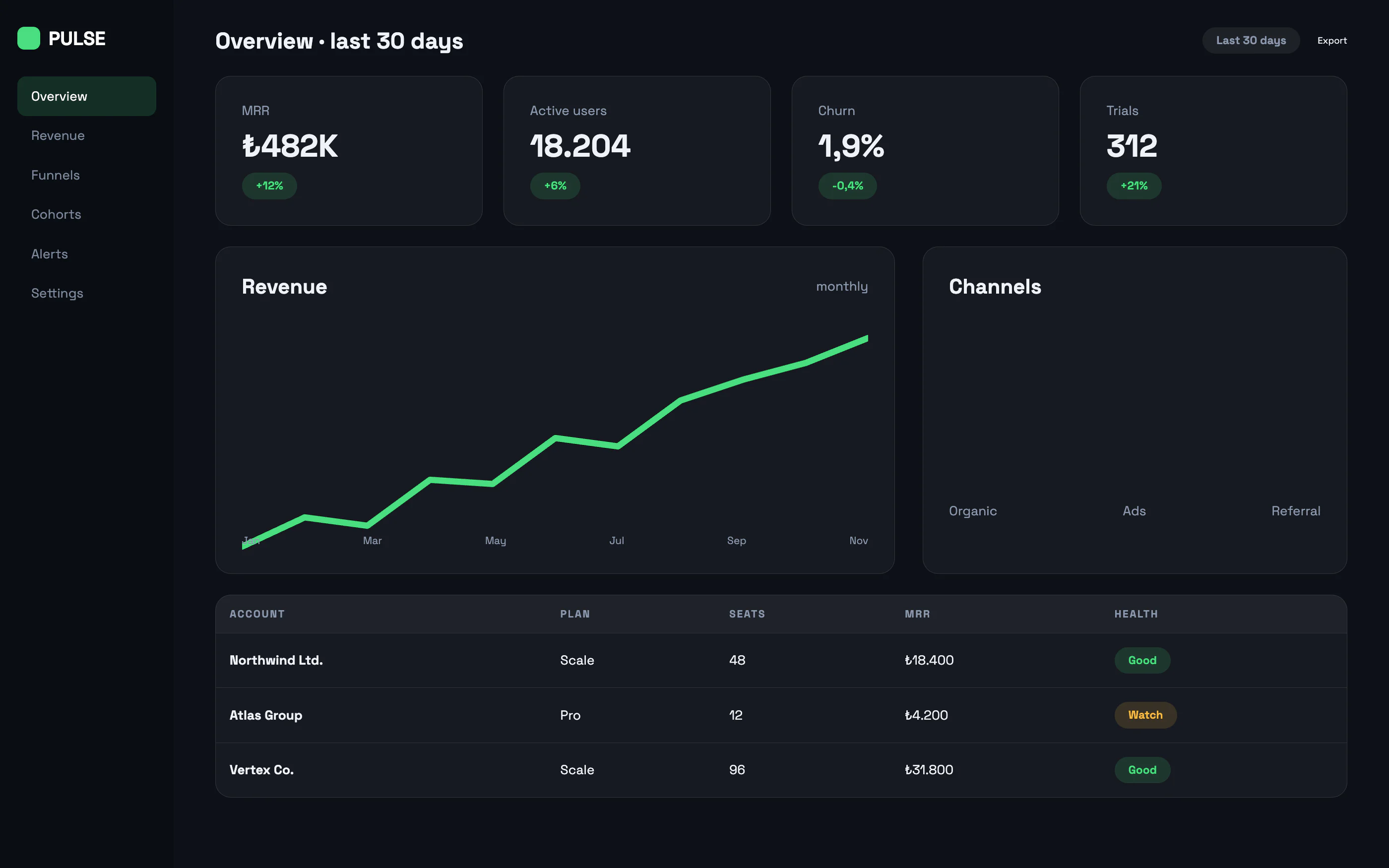
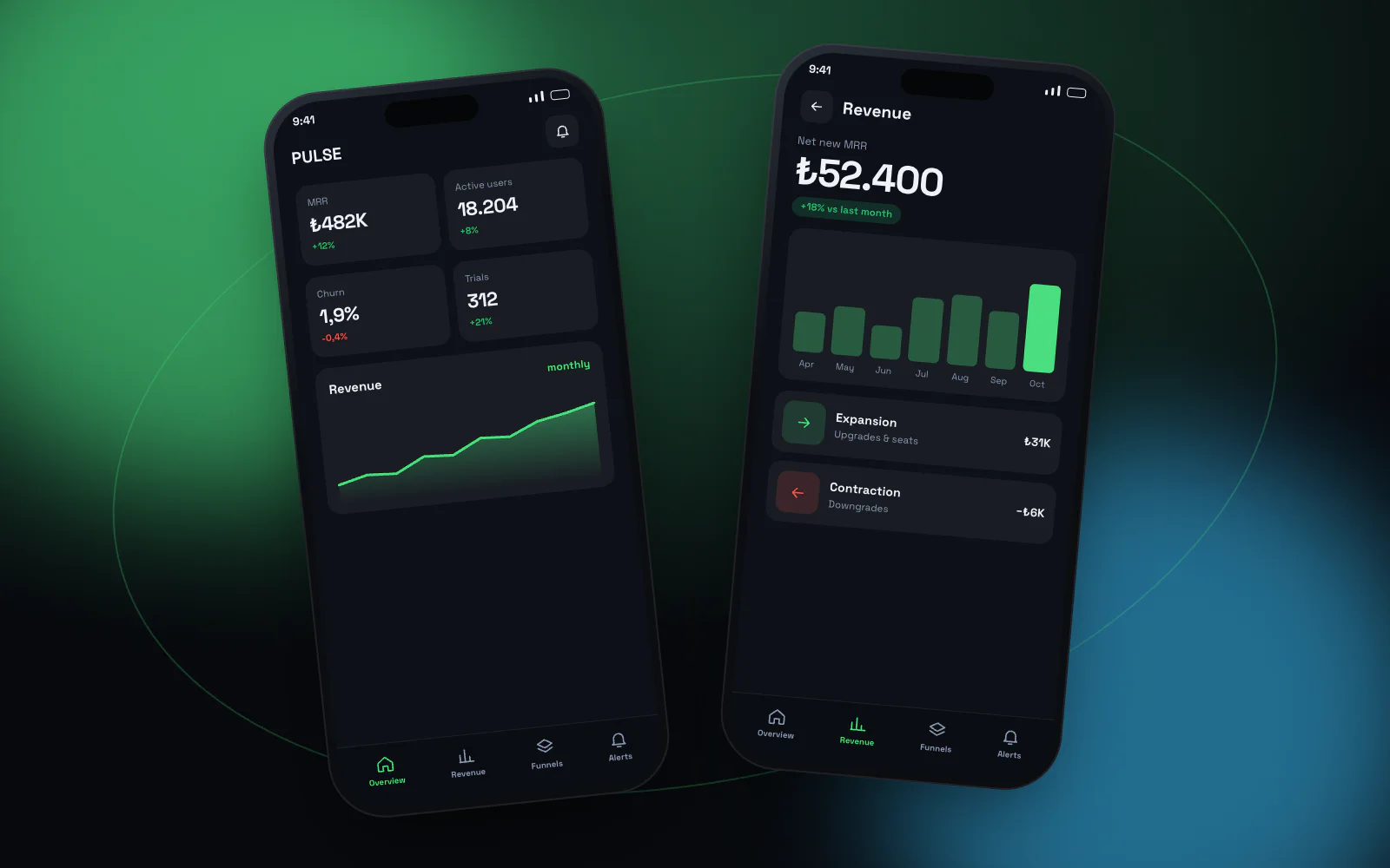
The hardest part of dashboard design is removing data. Here the top of the screen carries only four metrics: monthly revenue, active users, churn and trials. Everything else opens on demand.
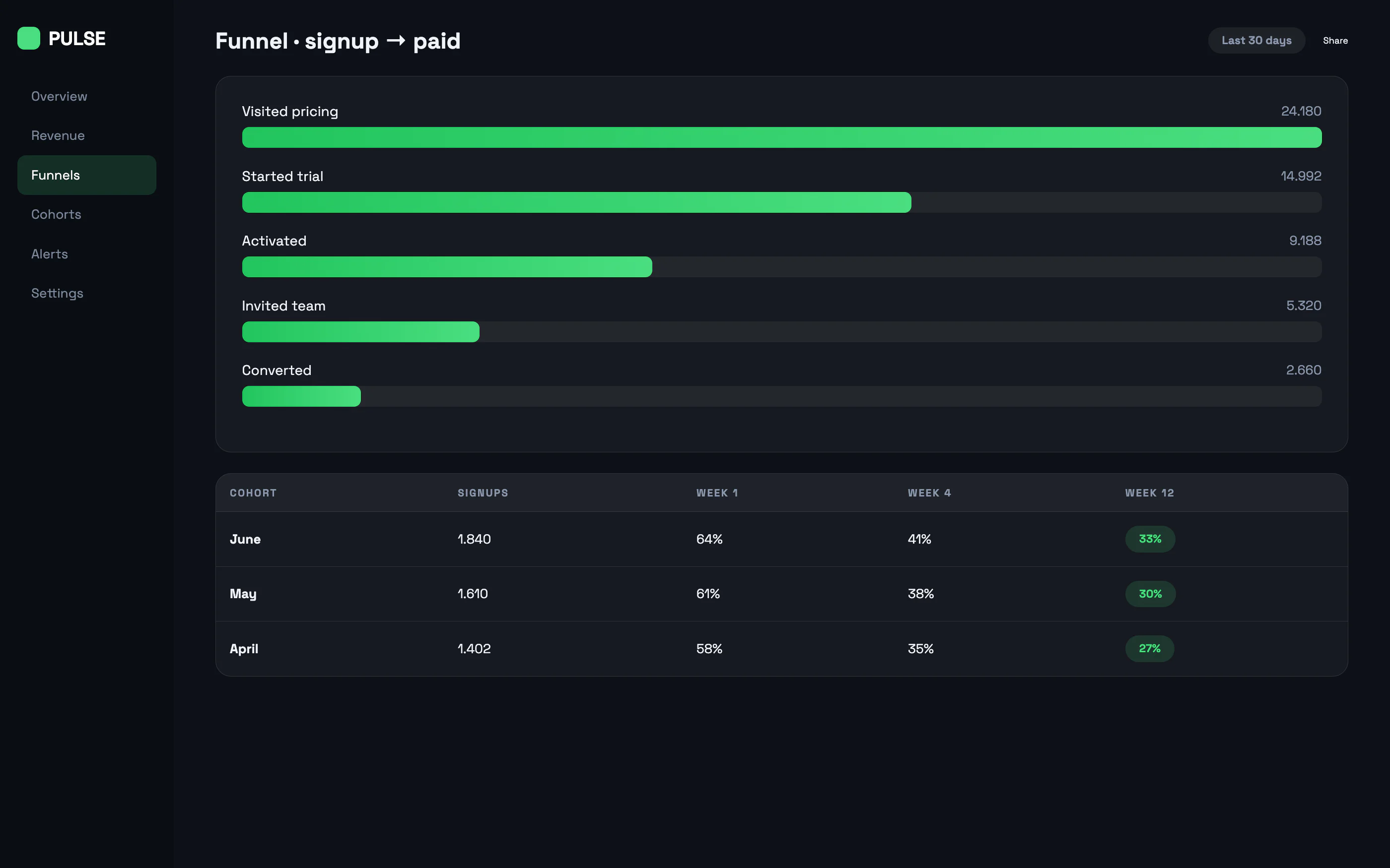
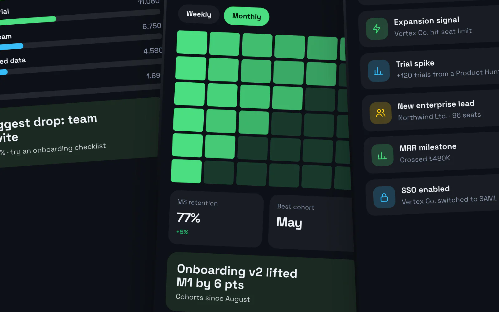
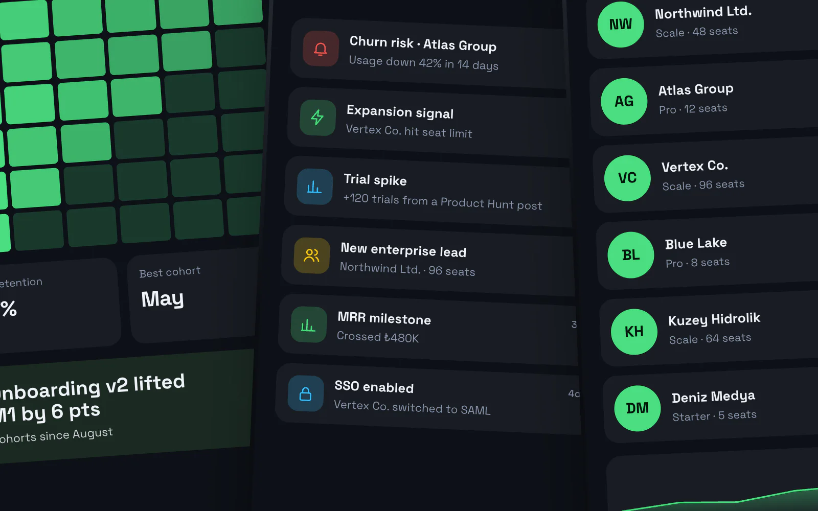
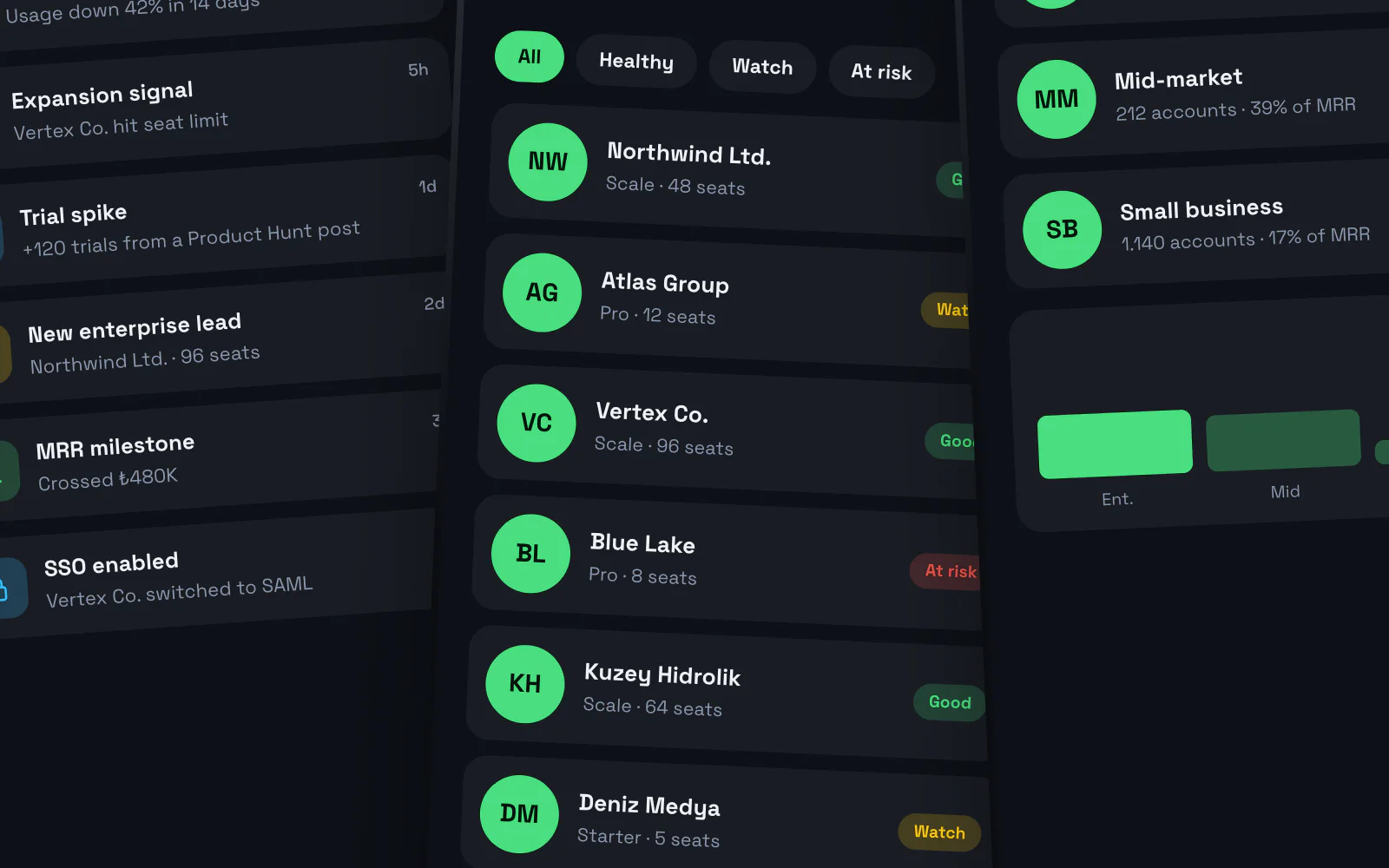
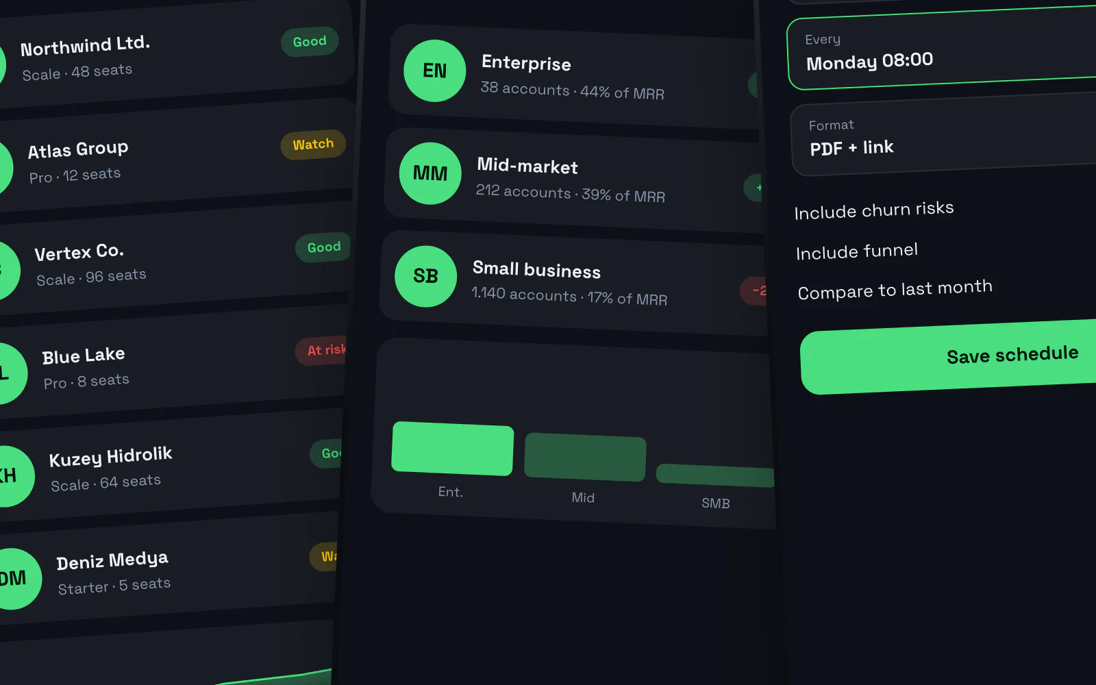
The revenue chart and channel mix sit side by side, with an accounts table below where each row carries a health tag. The inner page adds a conversion funnel and cohort table showing where users drop off.
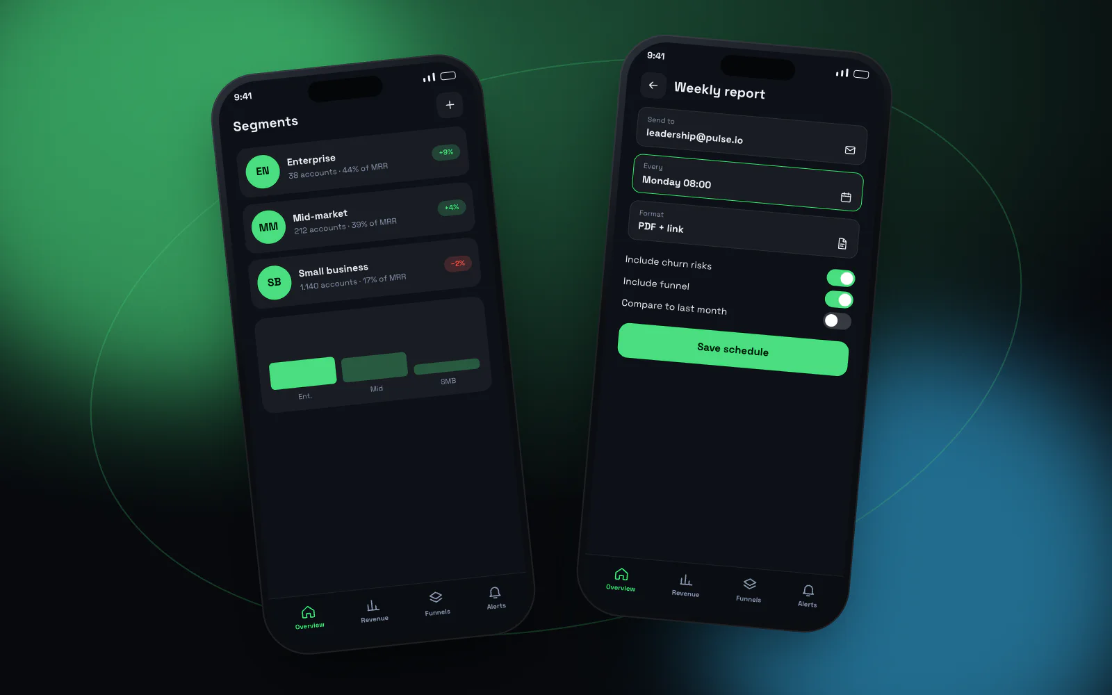

Four metrics, one screen
Decisions first, detail secondHigh-contrast charts on a dark interface, each metric paired with its change. Account health is colour-tagged in the table.
- Revenue and channel charts
- Account health tags
- Period filter
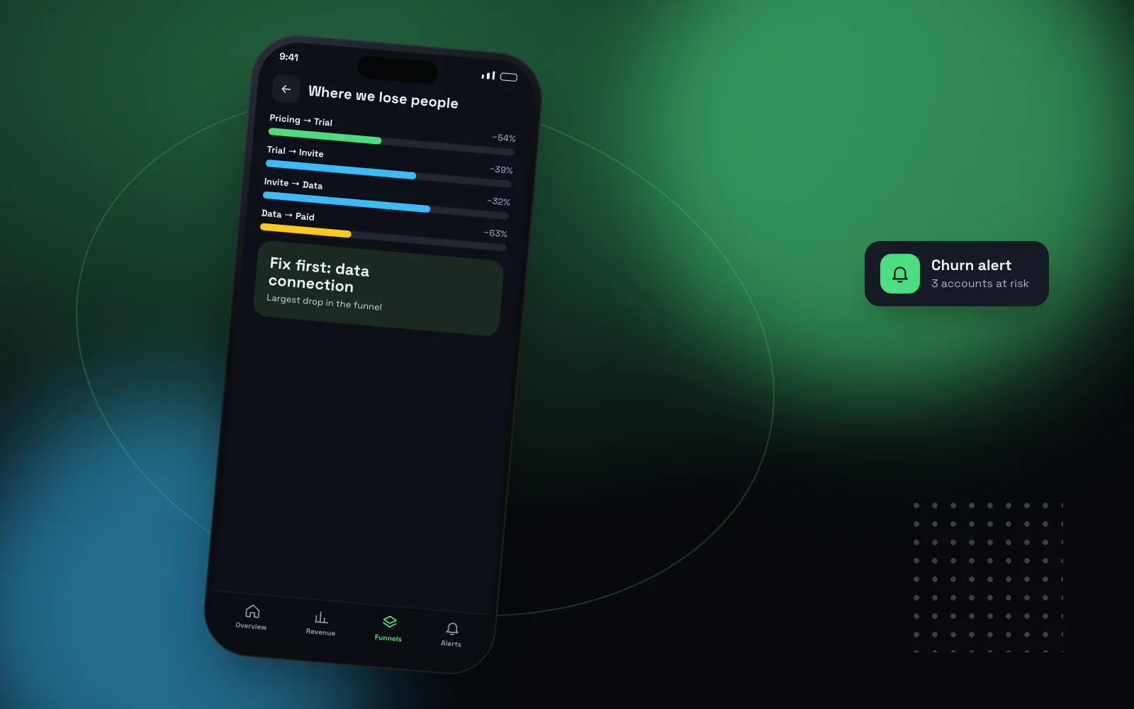
Where are we losing people?
Step-by-step conversionFive steps from pricing page to payment, each with a rate and a count, plus a cohort table showing retention by month.
- Conversion funnel
- Cohort table
- Export
- React
- TypeScript
- PostgreSQL
- SVG charts
- Role-based access
More projects


Have an idea or a project? Get in touch!
We're here. Tell us about your idea and we'll show you how to bring it to life — the first call and the quote are free.